 English | EN
 Accordion Fullwidth Image Block:
The block is used to add an image with a title and description on the web pages. You can customize the block with various settings.
Features and Functionalities
Heading Section:
- Title: You can add a heading with a maximum of 50 characters.
- Description: There is 300 words limit for the description, allowing for detailed information.
2. Capgemini Fullwidth Accordion Inner Item:
- Image: Add one image to the inner item.
· Title Text:
- Character Limit: 50 characters.
- Purpose: This is the main title for the inner item.
· Subtitle Text:
- Character Limit: 90 characters.
- Purpose: This subtitle provides additional context or information.
· Description:
- Character Limit: 300 characters.
You can add as much detail as needed.
3. Customization Options:
- Background Color: You can set a background color
- Can change the image from default to Content image as per your requirements.
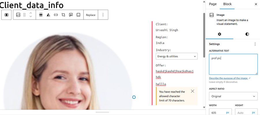
Client data info
The Client_data_info block is designed to display detailed client information, including name, region, industry, offer, and feedback, on web pages. It helps organize and present client data in a structured and visually appealing manner, enhancing user experience and accessibility.
Features and Functionalities
1. Add Group Block
- Insert a Group Block.
- Set the layout to Full Width Single Column.
2. Add Column Block
- Inside the Group Block, add a Column Block.
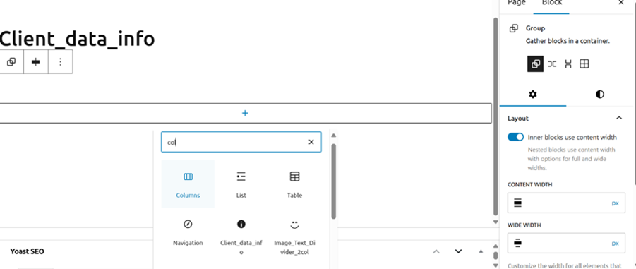
- Choose padding configuration 66/33.
3. Left Side (66): Image Block
- Add an Image Block for the client’s profile picture.
- Provide alternative text for the image to display if the image fails to load.
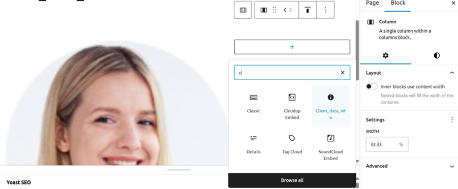
4. Right Side (33): Client_data_info Block
- Add the Client_data_info block.
Fill in the following fields:
- Name: Limit of 25 words.
- Region: Limit of 25 words.Industry: Select from dropdown.Offer: Limit of 25 words.
- Feedback: Limit of 70 words.
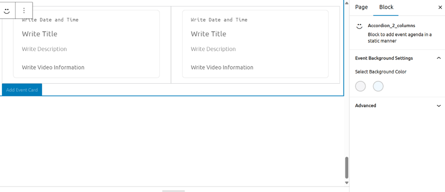
Accordion 2 Columns:
The Accordion 2 Columns block is designed to display event cards in a structured and visually appealing manner, allowing users to add detailed event information.
Features and Functionalities
1. Add Accordion 2 Columns Block
- Insert an Accordion 2 Columns block.
- Set the block heading/title (up to 25 words).
- Choose the background color (white or blue).
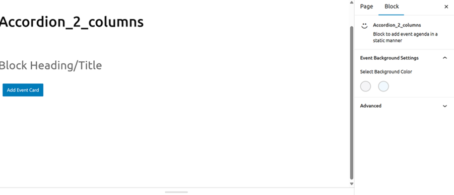
2. Add Event Card Button
- Click the Add Event Card button to create a new event card.
- Icon: Choose between a video icon and a YouTube icon.
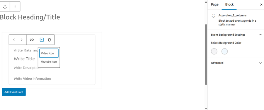
3. Event Card Details
- Date and Time: Enter the event’s date and time.
- Title: Enter the event title (up to 40 characters).
- Description: Provide a detailed description of the event (up to 250 words).
- Video Description: Add a video description if applicable.
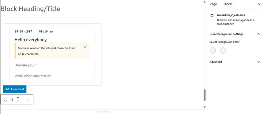
4. Add Multiple Event Cards
- You can add up to 30 event cards in a single Accordion 2 Columns block.
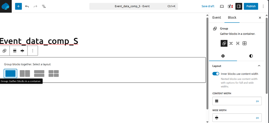
Event_data_comp_S :
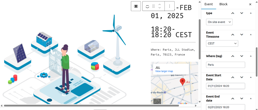
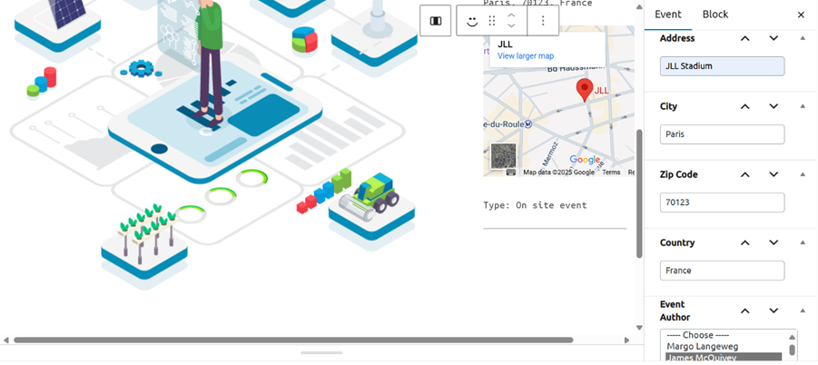
The Event_data_comp_S block is designed to display specific event details, including tags, map, region, and type, in a structured and customizable manner.
Features and Functionalities
1. Create a new event and add Group Block
- Insert a Group Block.
- Set the layout to Full Container.
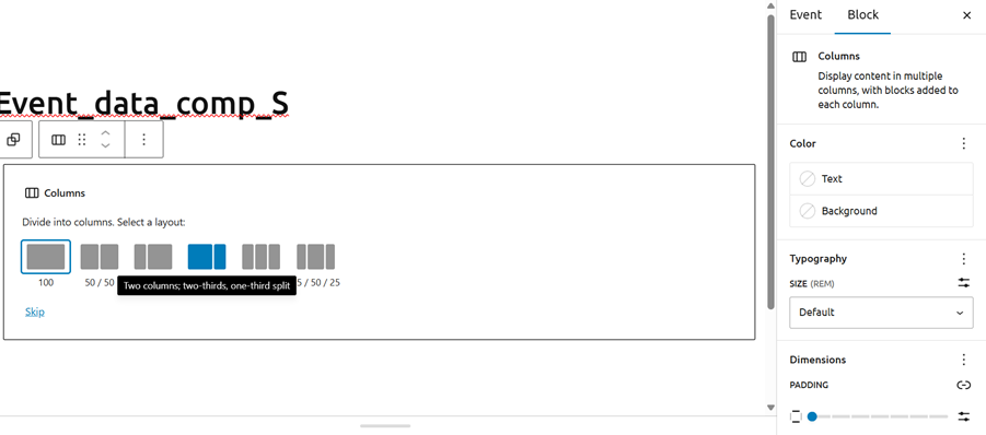
2. Add Column Block
- Inside the Group Block, add a Column Block.
- Choose padding configuration 66/33.
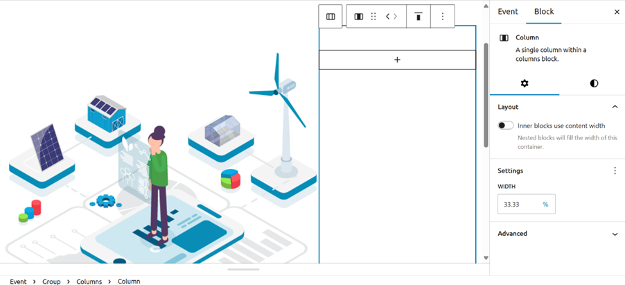
3. Left Side: Image or Text Block
- Add an Image Block or Text Block for any relevant content (e.g., event image or description).
4. Right Side: Check Event Section
- Add all the information
- Such as type of event, Event time zone, where (tag), Event Start date, Event end date, Address, City, zip code, Country, Event Author
5. Right Side: Check Block Section
- Configure the following toggle buttons:
- Show Tag: Turn on if you want to display the event tag.
- Show Map: Turn on if you want to display the event map.
- Show Region and Type: Turn on if you want to display the event region and type.

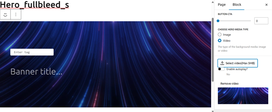
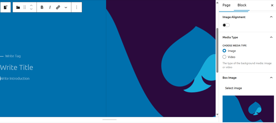
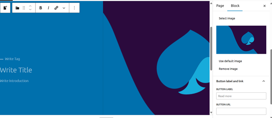
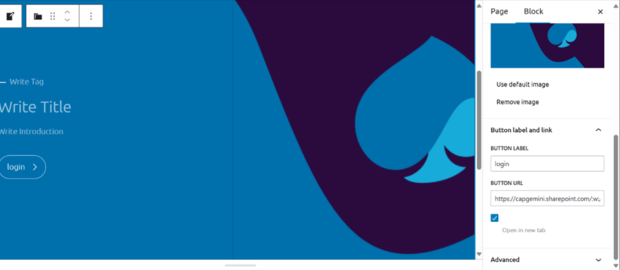
Hero_fullbleed_s :
The Hero_fullbleed_s block is designed to display a prominent banner with a tag and title, along with customizable background media.
Features and Functionalities
1. Add Hero_fullbleed_s Block
- Insert the Hero_fullbleed_block.
- Enter the tag and banner title.
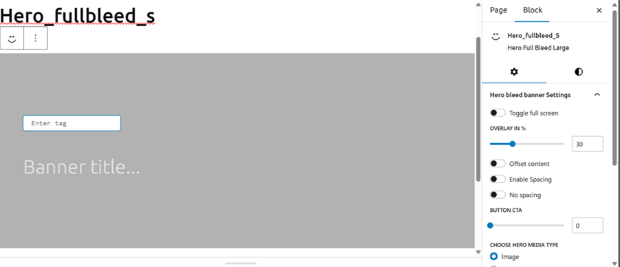
2. Toggle Buttons
- Full Screen: Turn on to enable full-screen mode.
- Offset Content: Turn on to offset content.
- Spacing: Turn on to add spacing.
- No Spacing: Turn on to remove spacing.
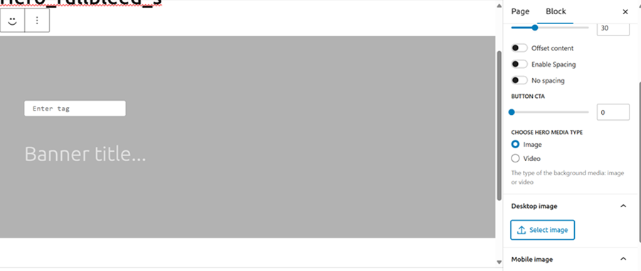
3. Background Media
- Image or Video: Add an image or video as the background.
- Video Options: Enable autoplay if using a video.
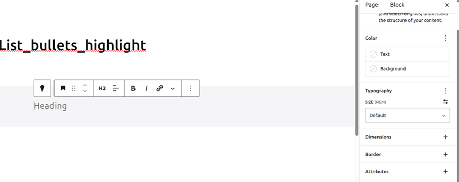
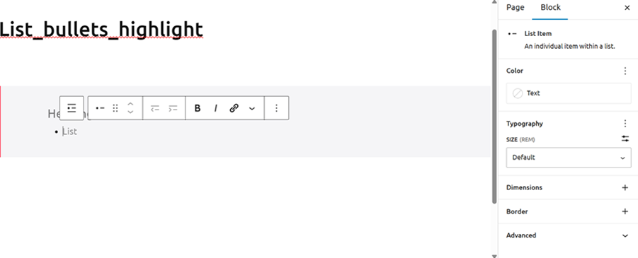
List_bullets_highlight:
The List_bullets_highlight block is designed to organize content with paragraphs, headings, and lists, allowing for customizable typography and colors.
Features and Functionalities
1. Paragraph, Heading, and List Block
- Add paragraphs, headings, and list items to structure your content.
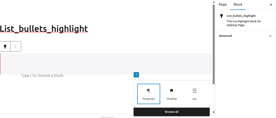
2. Typography Options
- Choose from various typography options to style your text.
3. Text Color
- Customize the color of the text.
4. Background Color
- Set the background color of the block if you wish to
.

Card_side_by_side_M:
The Card_side_by_side_M block is designed to display content with a default image, tag, title, introduction, and customizable background media.
Features and Functionalities
1. Add Card_side_by_side_M Block
- Insert the Card_side_by_side_M block.
- Default image is provided.
2. Content Fields
- Tag: Write tag (up to 25 characters).
- Title: Write title (up to 30 characters).
- Introduction: Write introduction (up to 350 characters).
3. Image Alignment
- Change the alignment of the image within the block.
4. Background Media Type
- Choose between image or video for the background media.
5. Add Button
- Provide button label and URL.
- Check the box to open the link in a new tab.
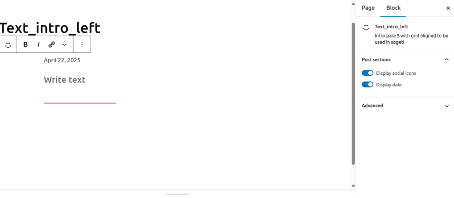
Text_intro_left:
The Text_intro_left block is designed to provide introductory text with customizable options for displaying social icons. Here is a stepwise description of its purpose, features, and functionalities:
Features and Functionalities
1. Add Text_intro_left Block
- Insert a Text_intro_left block.
- Set the block heading/title.
- Enter the introductory text.
2. Input Date and Text
- You can not customize the date field.
- Write the introductory text in the text field.
3. Customize Display Options
- Use the toggle button for Display Social Icons to show or hide social media icons.
- Use the toggle button for Display Date to show or hide the date.
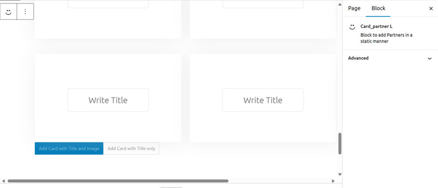
Card_partner L :
The Card_partner L block is designed to display partner information in a structured and visually appealing manner.
Features and Functionalities
1. Add Card_partner L Block
- Insert a Card_partner L block.
- Set the block heading/title.
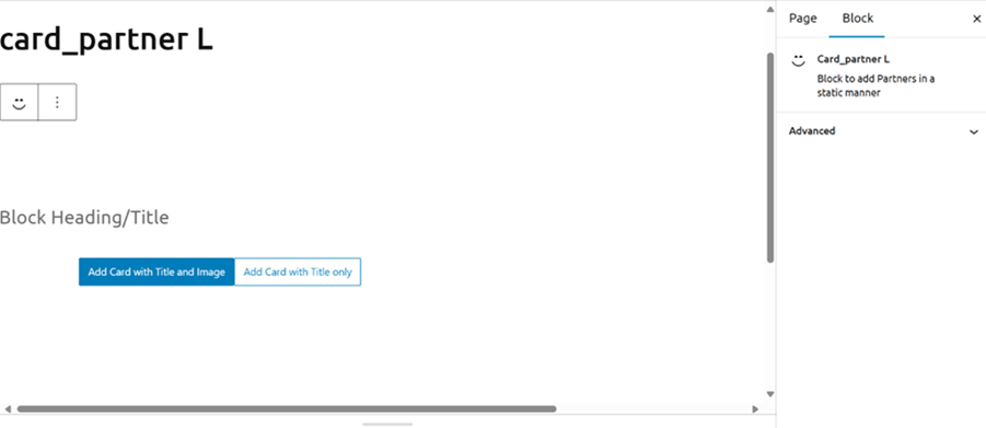
2. Card Types
a. Card with Title and Image:
- Title: Enter the title (up to 20 characters).
- Image: Upload an image from the system or select from the media library.

b. Card with Title Only:
- Title: Enter the title (up to 40 characters).
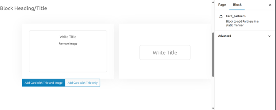
3. Add Multiple Cards
- You can add up to 20 cards in a single Card_partner L block.
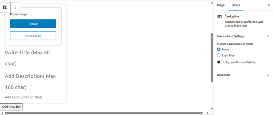
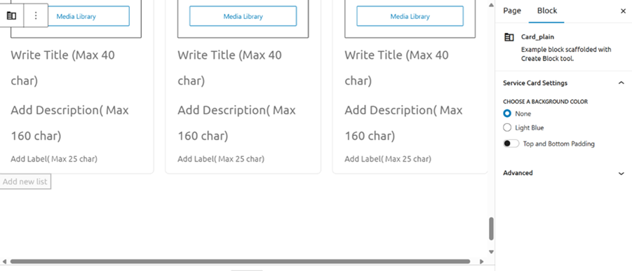
Card_plain:
The Card Plain Block is designed to help you create visually appealing lists that can display information in a structured and organized manner. This block is useful for showcasing multiple items, such as products, services, or any other content that benefits from a list-based layout.
Features and Functionalities
1. Create a Card Plain Block:
- Start by creating a new Card Plain Block in your project.
2. Add Title and Customize Background:
- Enter a title for the block (up to 50 characters).
- Choose a background color (blue or none).
- Turn on padding if desired.
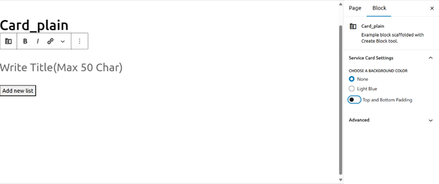
3. Add New List:
- Click on “Add New List” to create a new list card.
4. Customize Each Card:
- Image: Upload or select an image for the card.
- Title: Enter a title for the card (up to 40 characters).
- Description: Enter a description for the card (up to 160 characters).
- Label: Enter a label for the card (up to 25 characters).
5. Repeat for Additional Cards:
- Repeat the process to add more cards, up to a maximum of 30 cards.
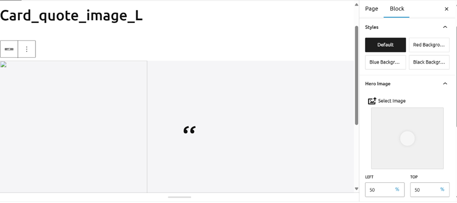
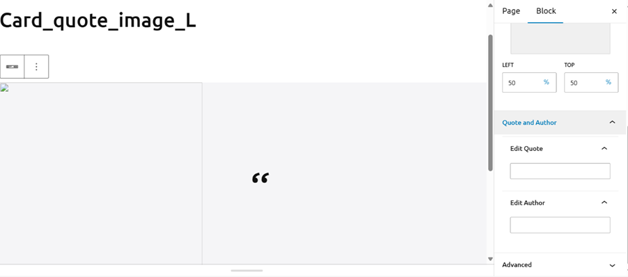
Card_quote_image_L:
The Card_quote_image_L Block is designed to display a quote alongside an image, with the image positioned on the left and the quote and author on the right. This block is ideal for highlighting inspirational quotes, testimonials, or any other text that benefits from visual emphasis.
Features and Functionalities
1. Create a Card_quote_image_L Block:
- Start by creating a new Card_quote_image_L Block in your project.
2. Add Image:
- Upload or select an image for the left-hand side of the card.
- Use the circle overlay to focus on a specific part of the image if desired.
3. Style Background:
- Choose a background color for the card: default, red, blue, or black.
4. Add Quote:
- Enter the quote text in the block section, with a maximum length of 300 characters.
5. Add Author:
- Enter the author’s name in the block section, with a maximum length of 100 characters.
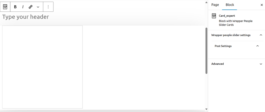
Card_expert:
The Card_expert Block is designed to showcase expert profiles with additional functionalities such as linking and forms. This block is useful for highlighting key individuals, their expertise, and providing interactive elements for user engagement.
Features and Functionalities
1. Create a Card_expert Block:
- Start by creating a new Card_expert Block in your project.
2. Add Headline:
- Enter a headline for the block to introduce the expert profiles.
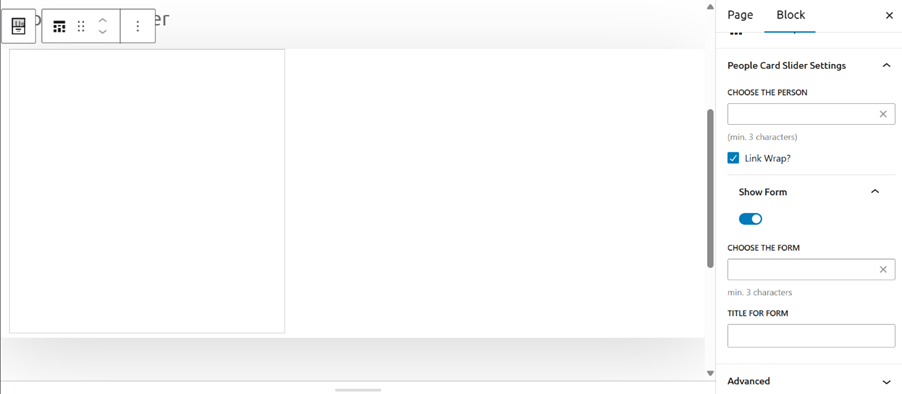
3. Choose Person:
- Select the person you want to feature in the card from the block section.
4. Enable Link Wrap:
- If you want the card to be clickable, check the checkbox for link wrap.
5. Show Form:
- Turn on the toggle button to display a form within the card.
6. Choose Form:
- Select the form you want to integrate into the card.
7. Add Form Title:
- Provide a title for the form to explain its purpose or instructions.
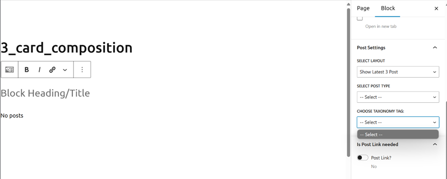
3_card_composition:
The 3_card_composition Block is designed to display a composition of three cards with various customization options. This block is useful for showcasing multiple items, such as articles, products, or any other content that benefits from a card-based layout.
Features and Functionalities
1. Heading:
- You can add a heading to the block to introduce the content.
- This helps to provide context and draw attention to the block.
2. Background Color:
- You can select a background color for the block. This allows you to customize the appearance to match your design preferences.
3. Curve Background:
- If you want to show a curved background, turn on the toggle button for “Show Curve Background.”
- You can also flip the curved background by turning on the toggle button for “Flip Curve Background.”
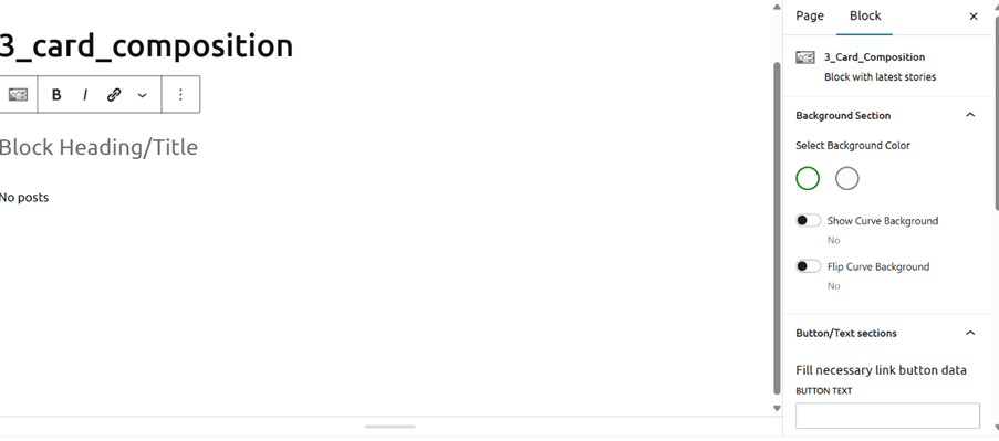
4. Button:
- If you want to add a button, provide the text and link for the button.
- This feature enables users to navigate to additional information or related content.
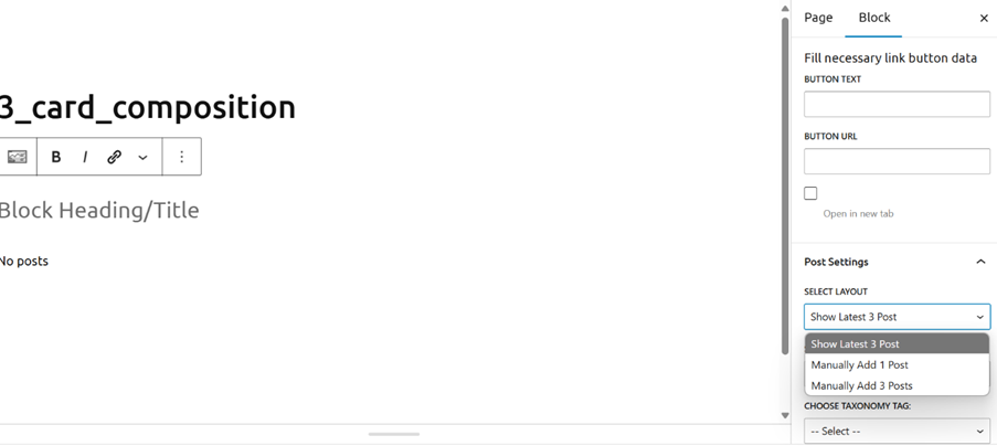
5. Post Settings:
- Select Layout: Choose the layout for displaying the posts.
- Post Type: Select the type of posts you want to display.
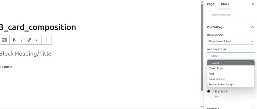
- Taxonomy Tag: Choose the taxonomy tag to filter the posts.
- Post Link: If you need a post link, turn on the toggle button for “Post Link.”
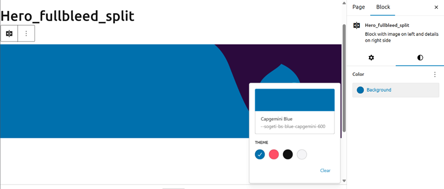
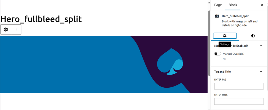
Hero_fullbleed_split:
The Hero_fullbleed_split Block is designed to create a visually striking section with an image on the left and details on the right. This block is ideal for highlighting key information, announcements, or promotional content.
Features and Functionalities
1. Create a Hero_fullbleed_split Block:
- Start by creating a new Hero_fullbleed_split Block in your project.
2. Image:
- You can have default image on the right-hand side of the block.
- The image helps to visually engage users and draw attention to the content.
3. Details on Right Side:
- The right side of the block is reserved for text details, including tags, titles, and author information.
4. Background Color:
- You can choose a background color for the block. The available options are red, white, blue, and black.
- This feature allows you to customize the appearance of the block to match your design preferences.
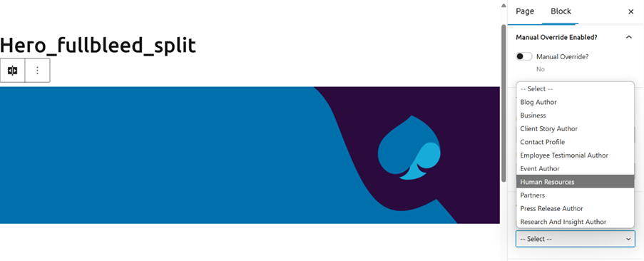
5. Manual Override:
- If you want to enable manual override, turn on the toggle button for manual override.
- This feature allows you to manually adjust settings or content as needed.
6. Add Tag:
- You can add a tag to the block, with a maximum length of 20 characters.
- Tags help to categorize or highlight specific aspects of the content.
7. Add Title:
- You can add a title to the block, with a maximum length of 65 characters.
- The title provides a clear and concise heading for the content.
8. Author Block Settings:
- You can select the type of people from the given options in the author block settings.
- This allows you to attribute the content to specific individuals or groups.
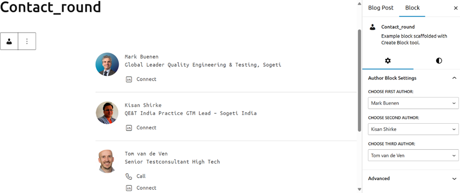
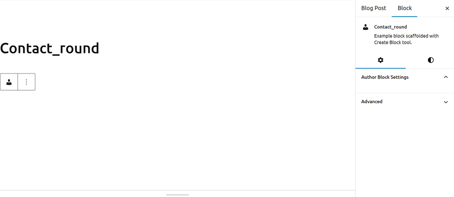
Contact_Round:
The Contact_round Block is designed to add author information to a blog post. This block is useful for attributing content to multiple authors and providing readers with information about the contributors.
Features and Functionalities
1. Add Block in Blog Post:
- Start by adding the Contact_round Block to your blog post.
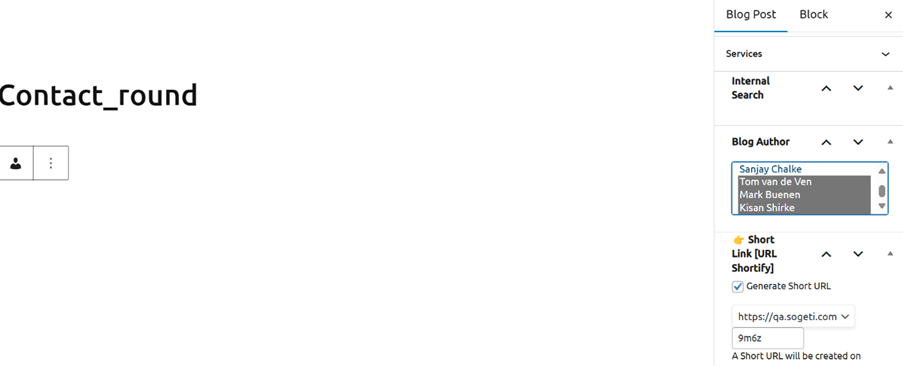
2. Select Blog Author:
- Choose the authors you want to feature in the blog post.
- You can select multiple authors from the available options.
3. Save as Draft:
- Save the blog post as a draft to ensure your changes are not lost.
4. Refresh the Page:
- Refresh the page to update the blog post with the selected authors.
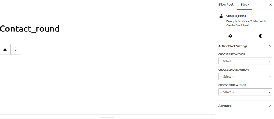
5. Add Authors:
- Go to the Contact_round Block and add the authors you have selected.
- This step ensures that the author information is correctly displayed in the blog post.
6. After adding all the authors, it will look like this