 English | EN
Accordion_single Block
Purpose: This block is designed to add a “Contact Us” section with customizable styles and button settings. 
Features and Functionalities:
- Styles: Choose from three assorted styles to match your website’s theme:
- Neutral Graphite: A sleek, modern look.
- Cool Tech Red: A vibrant, tech-inspired design.
- Blue Vibrant: A bright, energetic style.

Button Label and Link:
- Button Label: Customize the label for the button (e.g., “Contact us”).
- Open In: Choose how the button link opens:
- Open in same tab: The link opens in the current tab.
- Open in new tab: The link opens in a new browser tab.
- Popup: The link opens in a popup window.
- Button URL: Specify the URL the button will link to (e.g., www.xyz.com).(Max 100 characters)

- Extra Margin Setting: Adjust the spacing around the block:
- Add extra margin below: Adds additional space below the block.
- Remove extra margin: Removes any extra margin.
- Add extra margin: Adds extra margin around the block.

- Char Limit for Heading: 150 characters
Ribbon_text&CTA Block
Purpose: This block is designed to add a “Contact Us” section with customizable styles and button settings.
Features and Functionalities:
- Styles: Choose from three different styles to match your website’s theme:
- Neutral Graphite: A sleek, modern look.
- Cool Tech Red: A vibrant, tech-inspired design.
- Blue Vibrant: A bright, energetic style.
Button Label and Link:
- Button Label: Customize the label for the button (e.g., “Contact us”).
- Open In: Choose how the button link opens:
- Open in same tab: The link opens in the current tab.
- Open in new tab: The link opens in a new browser tab.
- Popup: The link opens in a popup window.
- Button URL: Specify the URL and the button will link to (e.g., www.xyz.com).
- Open In: Choose how the button link opens:
Extra Margin Setting: Adjust the spacing around the block:
- Add extra margin below: Adds additional space below the block.
- Remove extra margin: Removes any extra margin.
- Add extra margin: Adds extra margin around the block.
3_card_comp_vertical_L/S Block
Purpose: This block is designed to display content in a vertical card format with customizable settings.
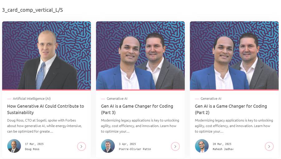
Features and Functionalities:
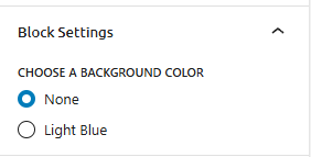
Block Settings:
- Choose a Background Color:
- None
- Light Blue
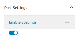
Post Settings:
- Enable Spacing Option to add spacing between posts.
- Select Layout: Choose the layout for displaying posts. Options include:
- Show Latest 3 Posts
- Show Latest 6 Posts
- Manually Add 3 Posts
- Manually Add 6 Posts
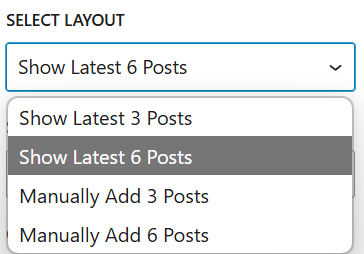
- Show Latest 6 Posts: Display the latest 6 posts.
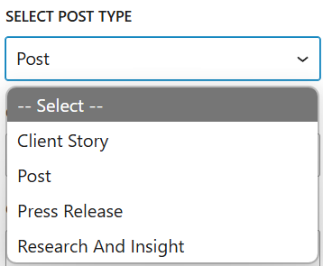
- Select Post Type: Choose the type of posts to display. Options include:
- — Select —
- Client Story
- Post
- Press Release
- Research And Insight
- Select Post Type: Choose the type of posts to display. Options include:
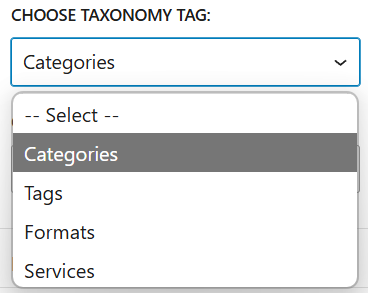
- Choose Taxonomy Tag: Select categories or tags for filtering posts. Options include:
- — Select —
- Categories
- Tags
- Formats
- Services
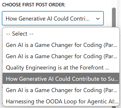
- Choose First Post Order: Set the order for the first post. Options include:
- — Select —
- Gen AI is a Game Changer for Coding (Part 1)
- Gen AI is a Game Changer for Coding (Part 2)
- Quality Engineering is at the Forefront
- How Generative AI Could Contribute to Success
- Harnessing the OODA Loop for Agentic AI
Character limits:
- Title: 34 characters
- Description: 300 characters
- Button Label: 24 characters
This block allows for a visually appealing and organized presentation of content, making it easy for users to navigate and engage with the latest posts.
Column Text Component with Image Variant
Purpose: This block is designed to display text content with an optional image, providing a flexible layout for various types of content.

Features and Functionalities:
- Post Sections: Choose the section of the post to display.
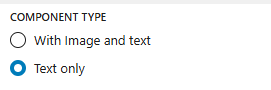
- Component Type:
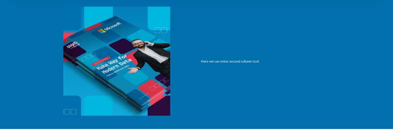
With Image and Text: Here, you can add text alongside an image.
Text Only: This option allows you to add text without an image.
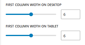
- First Column Width:
- On Desktop: Adjustable width, currently set to 6.
- On Tablet: Adjustable width, currently set to 6.
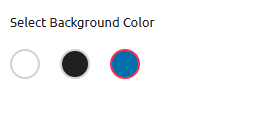
- Select Background Color: Choose from three color options:
- Black
- White
- Red
Character Limits :
- Title: 34 characters
- Description: 300 characters
- Button Label: 24 characters
This block allows for a customizable and visually appealing presentation of content, making it easy to adapt to different devices and design preferences.
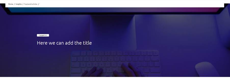
Hero Full Bleed Large Banner Configuration
Purpose: This block is designed to create a visually impactful banner that spans the full width of the screen, using either images or videos as the background. It is ideal for highlighting key messages or promotions on your website.
Features:
- Header Section:
- Title: Enter a title for the banner (e.g., “Hero_fullbleed_PR”). (Max 50 characters)
- Subtitle: Add a brief description or tagline (e.g., “Hero Full Bleed Large”). (Max 100 characters)
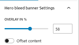
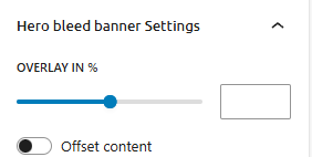
- Hero Bleed Banner Settings:
- Overlay in %: Adjust the overlay opacity with a slider to enhance text readability.
- Offset Content: Toggle to enable or disable offset content for a dynamic layout.
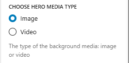
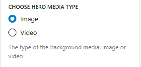
- Choose Hero Media Type:
- Image: Upload an image to use as the background.
- Video: Upload a video to use as the background.
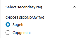
- Select Secondary Tag:
- Dropdown Menu: Choose a secondary tag to categorize the banner (e.g., Sogeti, Capgemini).
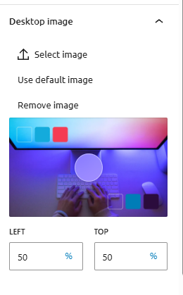
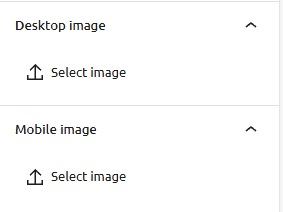
- Desktop Image:
- Button: Upload an image specifically for desktop view to ensure optimal display on larger screens.
- Mobile Image:
- Button: Upload an image specifically for mobile view to ensure responsiveness on smaller screens.
This block provides a versatile and visually appealing way to present key messages or promotions on your website. By utilizing full-width images or videos, along with customizable settings, you can create engaging and dynamic banners that enhance the user experience across different devices.
Graphic Block Configuration
Purpose: Configure a graphic block with animation and CTA button settings.
Features and Functionalities:
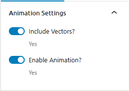
- Animation Settings:
- Include Vectors: Toggle to include vector graphics. (Yes/No)
- Enable Animation: Toggle to enable animations for the graphic block. (Yes/No)
- Frame Content Settings:
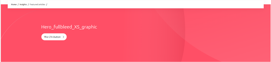
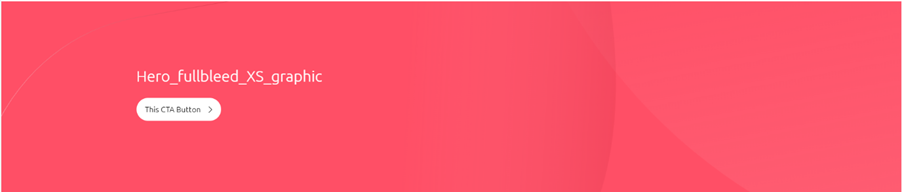
- Title: Enter a title for the frame content (e.g., “Hero_fullbleed_XS_graphic”).
- Add CTA Button: Toggle to add a Call-To-Action (CTA) button. (Yes/No)
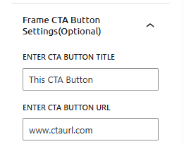
Frame CTA Button Settings (Optional):
- CTA Button Title: Enter the title for the CTA button (e.g., “This CTA Button”). (Max 20 characters)
- CTA Button URL: Enter the URL that the CTA button will link to (e.g., “www.ctaurl.com”). (Max 100 characters)
- Target Window: Choose whether the CTA button link should open in a new window. (Yes/No)

This block allows you to create engaging graphic content with optional animations and CTA buttons, enhancing user interaction and visual appeal on your website.
Hero_fullbleed_PR Block
Purpose: Create a visually impactful banner that spans the full width of the screen, using either images or videos as the background. Ideal for highlighting key messages or promotions on your website.
Features and Functionalities:
- Header Section:
- Title: Enter a title for the banner (e.g., “Hero_fullbleed_PR”). (Max 50 characters)
- Subtitle: Add a brief description or tagline (e.g., “Hero Full Bleed Large”). (Max 100 characters)
- Hero Bleed Banner Settings:
- Overlay in %: Adjust the overlay opacity with a slider to enhance text readability.
- Offset Content: Toggle to enable or disable offset content for a dynamic layout.
- Choose Hero Media Type:
- Image: Upload an image to use as the background.
- Video: Upload a video to use as the background.
- Select Secondary Tag:
- Dropdown Menu: Choose a secondary tag to categorize the banner (e.g., Sogeti, Capgemini). (Max 30 characters)
- Desktop Image:
- Button: Upload an image specifically for desktop view to ensure optimal display on larger screens.
- Mobile Image:
- Button: Upload an image specifically for mobile view to ensure responsiveness on smaller screens.
This block provides a versatile and visually appealing way to present key messages or promotions on your website. By utilizing full-width images or videos, along with customizable settings, you can create engaging and dynamic banners that enhance the user experience across different devices.
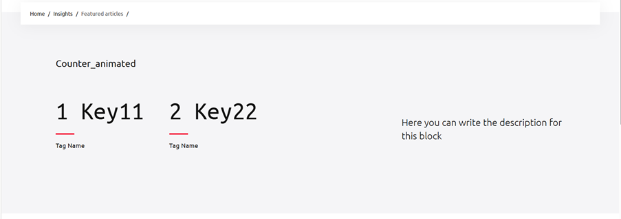
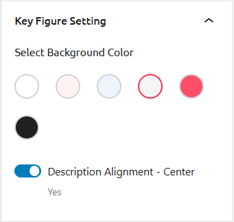
Counter_animated
Purpose: This block is designed to display key figures with animated headlines and descriptions. It is useful for showcasing important statistics or data in a visually appealing way.
Features and Functionalities:
- Select Background Color: You can choose the background color for the block. Options include:
- Red: Click to select the red background.
- Black: Click to select the black background.
Description Alignment:
- Center: Ensure the description text is centered. Toggle the switch to enable this setting.
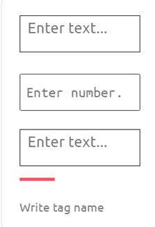
Adding Key Figures:
- Add New Key Figure: Click the button labeled “Add new key figure” to add additional key figures.
- Additional Key Figures:
- Number: Enter the number in the provided field labeled “Enter number.”.
- Text: Enter the text associated with this key figure in the input field labeled “Enter text…”.
- Tag Name: Enter the tag name for this key figure in the input field labeled “Write tag name”.
- Character Limit: Ensure the counter text does not exceed 7 characters.
- Headline Text: The headline text cannot exceed 50 characters. Ensure your headline is concise and within this limit.
- Description Text: The description text cannot exceed 150 characters. Make sure your description is brief and informative.
- Button Label: The button label cannot exceed 25 characters. Keep the label short and clear.
This block allows you to present key figures with animated headlines and centered descriptions, making it visually appealing and informative. The ability to add new key figures and customize their text and tags enhances the flexibility and usability of this block.
Ribbon_logos
Purpose: This block is designed to display a ribbon of logos, typically used to showcase partner or sponsor logos on a webpage.

Features:
- Logo Ribbon Settings:
- Select Files: Upload the logos you want to display in the ribbon.
- Logo Arrangement: Arrange the logos in a horizontal ribbon format.
This block allows you to present a series of logos in a ribbon format, making it ideal for highlighting partners, sponsors, or featured brands on your website.
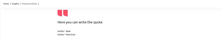
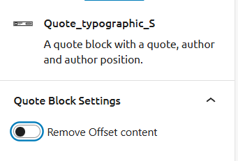
Quote_typographic_S
Purpose: This block is designed to display a quote along with the author’s name and position, providing a visually appealing way to highlight testimonials, famous quotes, or key messages.
Features and Functionalities:
- Quote Block Settings:
- Remove Offset Content: Toggle this option to remove any offset content, ensuring the quote block aligns perfectly with other elements on the page.
- Quote Text: Enter the quote text (e.g., “Here you can write the quote”).
- Author Name: Enter the name of the author (e.g., “Author Name”).
- Author Position: Enter the position of the author (e.g., “Author Position”).
This block allows you to present quotes in a clean and organized manner, making it ideal for showcasing important statements or endorsements on your website.
Textblock_centred
Purpose: This block is designed to create a standalone paragraph text with sufficient spacing on all sides, making it ideal for emphasizing important information or messages.

Features and Functionalities:
- Spaced Paragraph Block: Ensures the paragraph text is centered and has ample spacing around it for better readability and visual appeal.
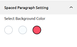
- Spaced Paragraph Setting:
- Select Background Color: Choose from various background color options to match your design. The available options include different colors, with the red background being one of them.
This block allows you to present text in a clean and focused manner, making it suitable for highlighting key points or standalone messages on your website.
This block allows you to present text in a clean and focused manner, making it suitable for highlighting key points or standalone messages on your website.
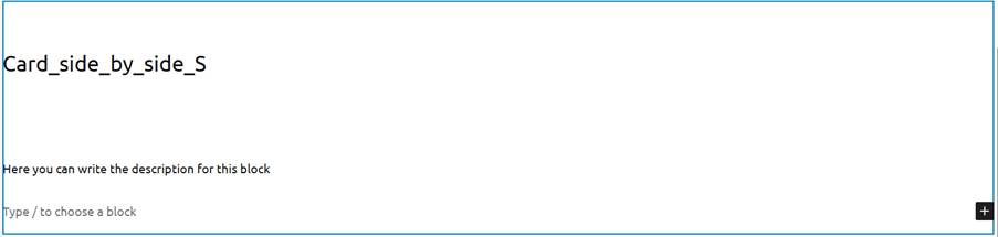
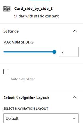
Card_side_by_side_S
Purpose: This block is designed to display content in a side-by-side card format, providing a visually appealing way to present information in a compact and organized manner.
Features and Functionalities:
- Description: Enter the description for this block (e.g., “Here you can write the description for this block”).
- Slider with Static Content:
- Maximum Sliders: Set the maximum number of sliders (e.g., up to 7).
- Autoplay Slider: Option to enable or disable autoplay for the slider.
- Select Navigation Layout: Choose the navigation layout from options such as “Default.”
This block allows you to present information in a side-by-side card layout with customizable slider settings, making it ideal for showcasing multiple pieces of content simultaneously.
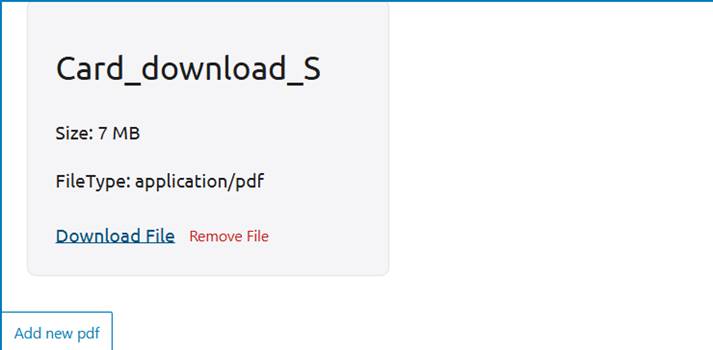
Card_download_S
Purpose: This block is designed to facilitate the download of files, providing a user-friendly interface for accessing downloadable content.
Features and Functionalities:
- File Details:
- File Name: Display the name of the file (e.g., “Card_download_S”).
- Size: Show the size of the file (e.g., 7 MB).
- File Type: Indicate the type of file (e.g., application/pdf).
- Download Options:
- Download File: Provide a hyperlink for users to download the file.
- Remove File: Offer a hyperlink to remove the file from the interface.
- Add New PDF: Include a button to add a new PDF file to the block.
This block allows users to easily download files, making it ideal for providing access to documents, reports, or other downloadable content on your website.